
Notifications
Retirer tout
Proline Studio
1
Posts
1
Utilisateurs
0
Reactions
12.8 {numéro}K
Vu
Début du sujet 20/09/2018 2:39 pm
Le fil de discussion est copié de l'ancien forum
Bonjour,
Pourriez-vous me donner quelques explications afin de bien évaluer les différentes méthodes et choisir la plus adéquate. Jusqu'à maintenant j'utilisais toujours la même mais jessaie de mieux comprendre ce genre de plot en comparant toutes ces méthodes (ci-joint un exemple)
D'avance merci
Bien cordialement
pmarcelo
Marcelo,
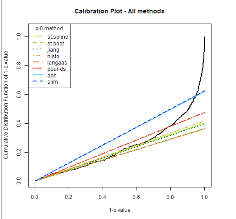
Here are some explanations for this plot.
The black curve displays the cumulative distribution for 1-pvalues. Thus :
On the left of the plot 1-pval is very small : pval is high thus proteins are non Differentially Abundant (non DA).
On the right of the plot, 1-pval is higher and higher : the pval are smaller and smaller indicating the proteins are considered as DA.
All the colored curves help visualizing pi0, which is the proportion of true null hypotheses (i.e. proteins are non DA) from a given vector of raw p-values (coming for the differential analysis : limma or Welch pvalues).
As this pi0 value is unknown it must be estimated. We calculate the pi0 following 8 different estimation methods from the literature (see R function estim.pi0() for details).
This proportion pi0 is later used as a correcting factor to compute the adjusted p-values (that are in turn used to tune a threshold according to a desired false discovery rate).
The goal of this plot is to allow you to visually select the pi0 calculation method that is the most adapted to the data, ie the colored curve which follows the best the linear part of the black line, but also accurately estimating the proportion of Non-DA and DA proteins in your sample.
[colored curve and the linear part of the black lines = representation of the same thing : pval of non DA proteins]
Example on your plot : (i) green lines follow very well the linear part of the black line, but cross this black line quite “low” on the graphics : you’ll declare a lot of proteins of your sample as DA, having low chance to miss some DA proteins, but non-negligible risk to declare some proteins as DA although they are not (false positive proteins). On the contrary (ii) the red (and a fortiori the blue) line is more conservative: you’ll have less DA declared proteins, but you can miss some of them (false negative notion).
The choice is a balance depending of your knowledge/expectations for your dataset : a lot or a few expected DA, willingness to be conservative or not so much, …
I hope that those explanations are clear and help you to understand better this plot. Don't hesitate to get back to me if needed.
You can also look at the Supporting Information file of the publication "Calibration plot for proteomics: A graphical tool to visually check the assumptions underlying FDR control in quantitative experiments" Giai Gianetto et al, 2016.
This is a very practical document with detailed explanations and examples.
Florence.